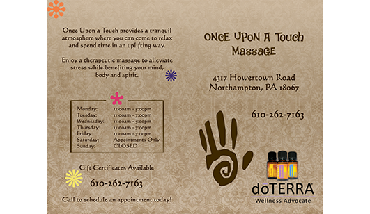
When Kelly, the owner of Once Upon a Touch Massage, began launching her new business, she reached out to iMarketing for support in building a brand that felt authentic, welcoming, and memorable from day one.
As a new business owner, she wanted more than just a logo. She wanted a cohesive visual identity that reflected both her calming approach to massage therapy and her vibrant personality.
Crafting the Brand Identity
iMarketing worked closely with Kelly to design a logo and establish a thoughtful, cohesive color palette. She envisioned earth-tone colors as her foundation (warm, grounded, and peaceful) complemented by playful pops of color that would showcase her approachable energy.
The final brand identity strikes a balance between serenity and personality. The natural tones communicate relaxation and trust, while the accent colors add vibrancy to reflect her fun-loving personality.
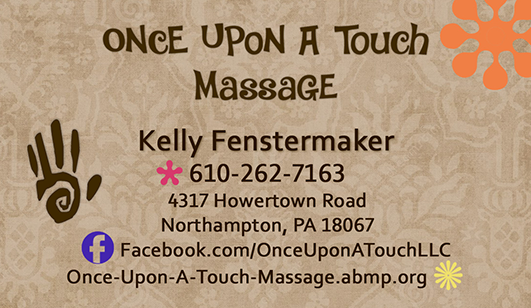
Business Card Design
Once the logo and brand standards were finalized, we extended the visual identity across essential business materials. Every piece was designed to feel cohesive, polished, and unmistakably Once Upon a Touch.
Custom business cards were created to make a memorable first impression while reinforcing the established color palette and brand personality.
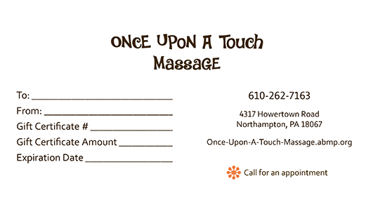
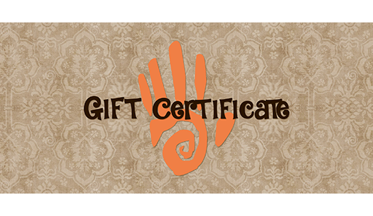
Gift Card Design
To support Kelly’s growing client base, iMarketing designed branded gift certificates – an important revenue and referral tool for massage therapy businesses.
These pieces were designed not only to match the brand visually, but to feel special and gift-worthy, enhancing the client experience from the very first interaction.
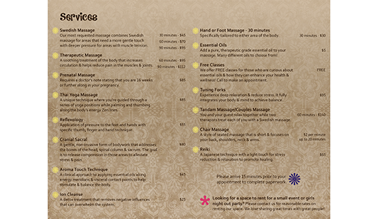
Service Menu Design
A custom services menu was developed to clearly present Kelly’s offerings in a way that felt organized, calming, and easy to navigate.
The design maintained brand consistency while prioritizing readability and flow, ensuring clients can quickly understand available services while experiencing the cohesive look and feel of the brand.